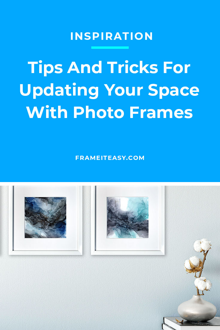
Take this simple test. Look around you. Now look closer at your walls. Your desktop. Your coffee tables. Your shelves. Does anything feel off? Maybe they’re missing the photos from your family trip you’ve been meaning to get framed. Perhaps the photos you already have are looking a little outdated and don’t quite match your current decor. Or it could be you just need a reboot on everything.
Now is a great time to update those walls, tabletops, desks, shelves….or anywhere else framed artwork can go! And you can do it yourself from home. If you need help with picking the perfect frame that’s going to complement your surroundings, we have some tips for you!
If you’ve visited our Learning Center, you know we always say that the best part about custom framing is the fact that you can choose to do whatever you want with your frames. The important thing to remember is they are your frames, so as long as you like it, that’s all that truly matters. However, we always provide you with some tips and tricks on what we think works well in case you need some help getting started.
Size Matters
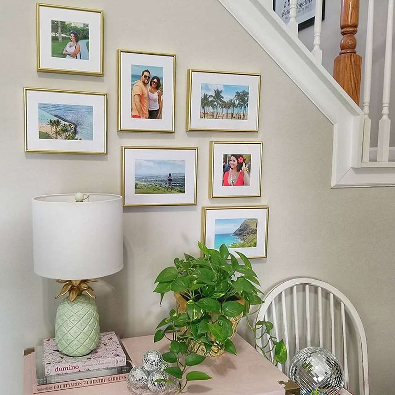
When we say size here, we mean several things: the size of your wall/desk/shelf space, the size of your artwork, the size of your frame. All three can help you determine which of our frames will work best in a given space.
Let’s say you have a large area over your living room couch to decorate. Are you considering one large piece of art, or several smaller pieces grouped together? If it’s for your desk, how much space can you dedicate? Can you have framed photos of each of your family members, or do you only have room to put one group shot? If you’re making a display for a mantel or shelf, are you incorporating other items? If your space is limited, maybe you can “overlap” your frames for a different look and still include all the items you want.
If you have existing artwork or photos that you want to display, use its dimensions to help you determine the right home for it. If you’re starting from scratch and decorating a specific area, experiment by using objects of varying sizes to direct you to the best use of your space.
To Mat Or Not To Mat
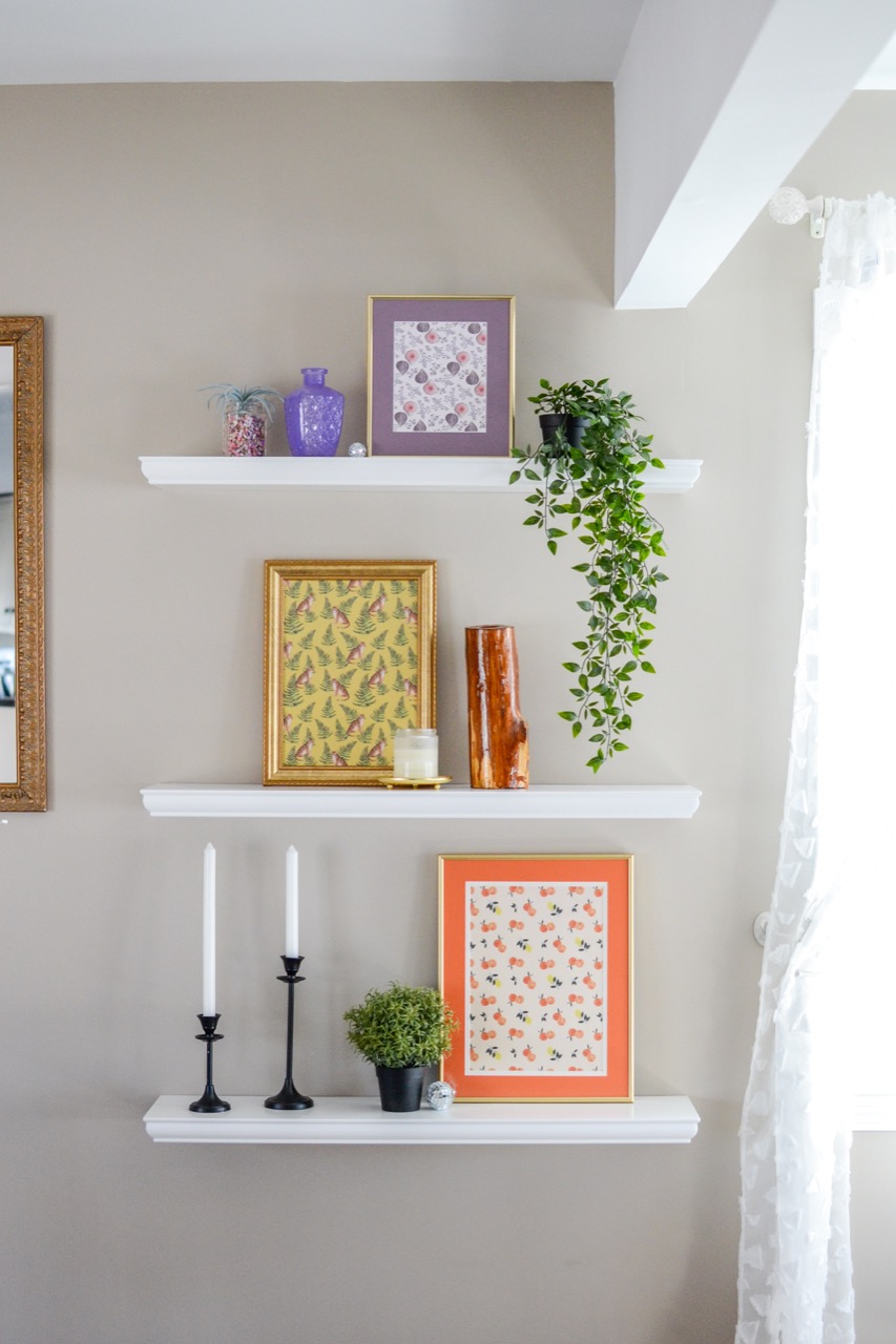
Here at Frame It Easy, you have the choice of adding a single mat, double mat, or opting not to use a mat at all. Matting is a great way to add additional impact to your artwork or photo, to create a crisp and finished look, and draw attention to your framed artwork. There are many ways you can go about adding a matboard to your frame (or not), so let’s go over your options.
When choosing whether or not to use matting, again take size into consideration, both the size of your artwork and the area you have to display it. For instance, a large piece such as a poster probably doesn’t need a matboard both because of its dimensions and where you are putting it, so in this instance, just skip the matting. Also, if you have smaller artwork but not at lot of room, you can likewise choose not to use a mat.
However, smaller pieces can get a boost with matting, especially when you will be displaying them in spacious locales. Our custom matting not only offers tons of colors to choose from but you can adjust the size of your outer mat to get your desired look. And don’t forget to try a white mat for a clean, classic look that is a customer favorite because it works well with just about everything.
If you are still not sure whether you should add one or two matboards or none at all, check out our post in our Learning Center on the different styles of matboards.
Color Considerations
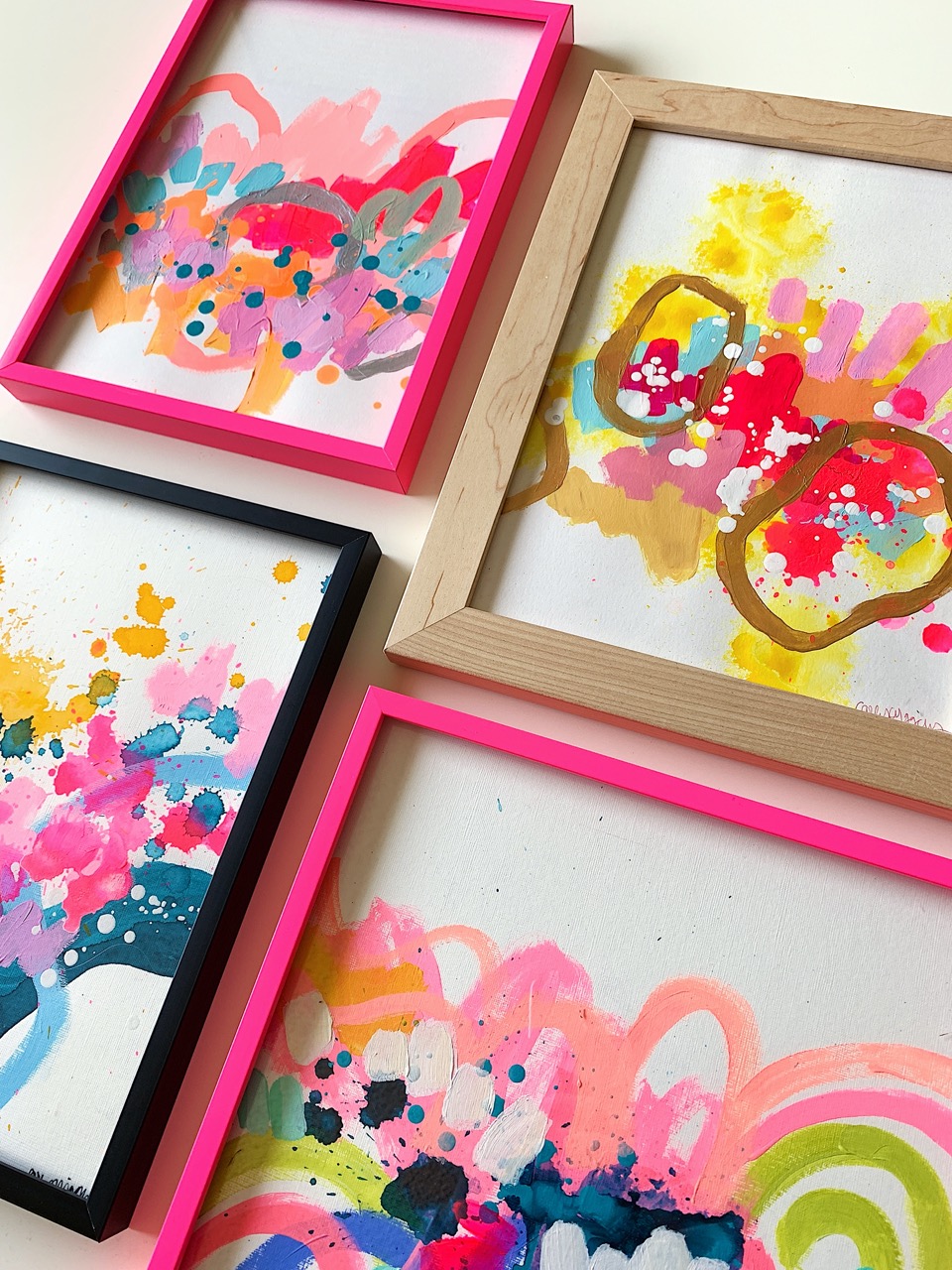
Do you have neutral walls that can use a pop of color? Or do they have deep tones that would clash with anything other than a traditional frame? If it’s color you need, when choosing matting, coordinate it with a “minor” color from your artwork for a cohesive look. Or try color with your frame itself. Check out the frame styles we offer in green, red, blue, and even hot pink! On the other hand, if you’re dealing with an area that has lots of color, stay with the tried and true white matting and frames in wood (we offer 16 shades) or metal (in gold or silver) for a professional look.
If you’re looking for new colors that will work with the current colors in your home, check out our post on home decor color schemes and which of our frames work best with them.
Hanging, Leaning, Free-Standing
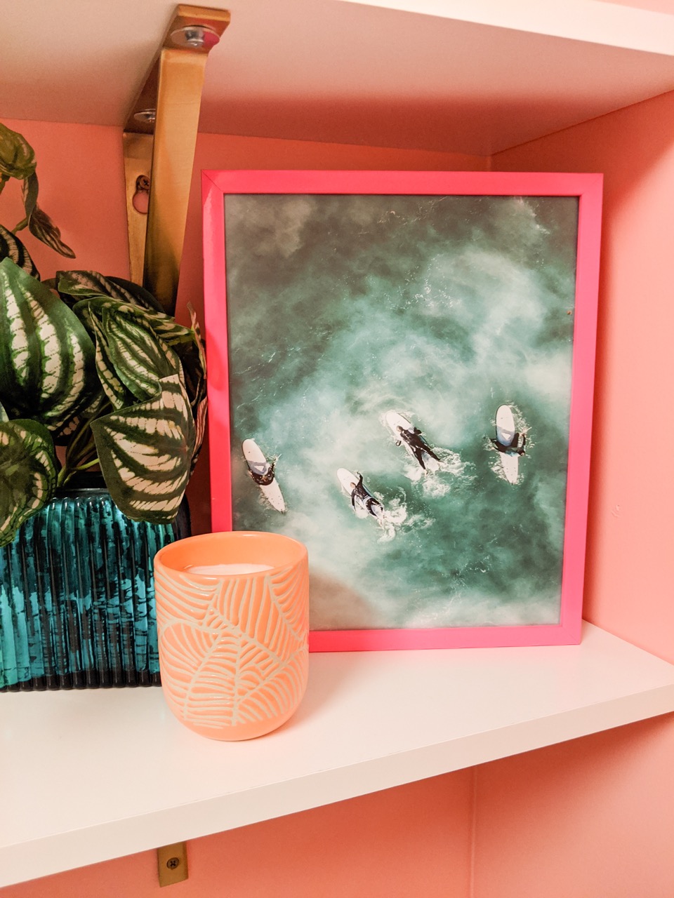
Whether you’re looking to update your family room gallery wall or even just your bedside table decor, we have exactly what you’re looking for! While most of our customers hang their frames on their walls, we also have the option of our EaselMate™ which acts as an easel for any of our frames up to 13” x 19”. If you choose to order EaselMate™ just be sure to add one to your cart through our accessories page. And don’t stop with walls and flat surfaces. Consider leaning your frames on shelving or mantels.
Of course, if you are hanging your frame, there is no need to order anything additional. Just get your hammer. Included with every frame purchased is all the hardware you’ll need, such as hanging wire, mounting brackets for stringing your hanging wire, spring clips to hold the frame contents in place, and even bumpers to protect your wall. We’ve thought of everything!
Uniformity or Variation
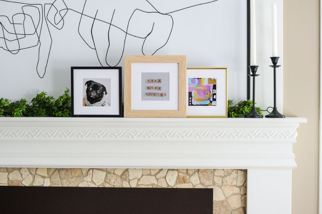
A gallery wall with matching frames is a classic look. Proportional frames on carbon copy walls in a room is a standard decorating go-to. However, for a change of pace, consider mixing and matching frame styles and colors that work well together. The combination can give your pieces a one-of-a-kind style that will not only be eyecatching but be a glimpse of your equally unique personality.
If you still need inspiration for your displays, check out our post in the Learning Center for the best ways to mix and match frame styles and colors.
Time To Update
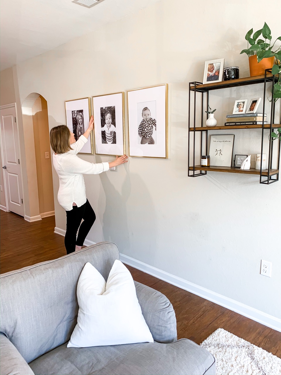
Now that it is officially spring, there’s no better time to give your environment and wall decor an update. And by using Frame It Easy for your custom framing, it doesn’t take a lot of time or money to make a huge difference. We hope these tips have given you some ideas to get you started.
If you’re looking for more ways to update your home for springtime, check out our Spring refresh post in our Learning Center.
