Color plays a crucial role in home decor and custom framing, setting the mood and enhancing the beauty of any space. The color wheel is a useful tool that helps you make informed decisions about which colors complement each other and how they can be used to create an aesthetically pleasing environment. Maybe you’re choosing a frame for a piece of artwork you’ve been meaning to frame or revamping your interior design as the seasons change. Understanding the basics of the color wheel will help you achieve a cohesive and stylish look like the pros.

The Basics of the Color Wheel
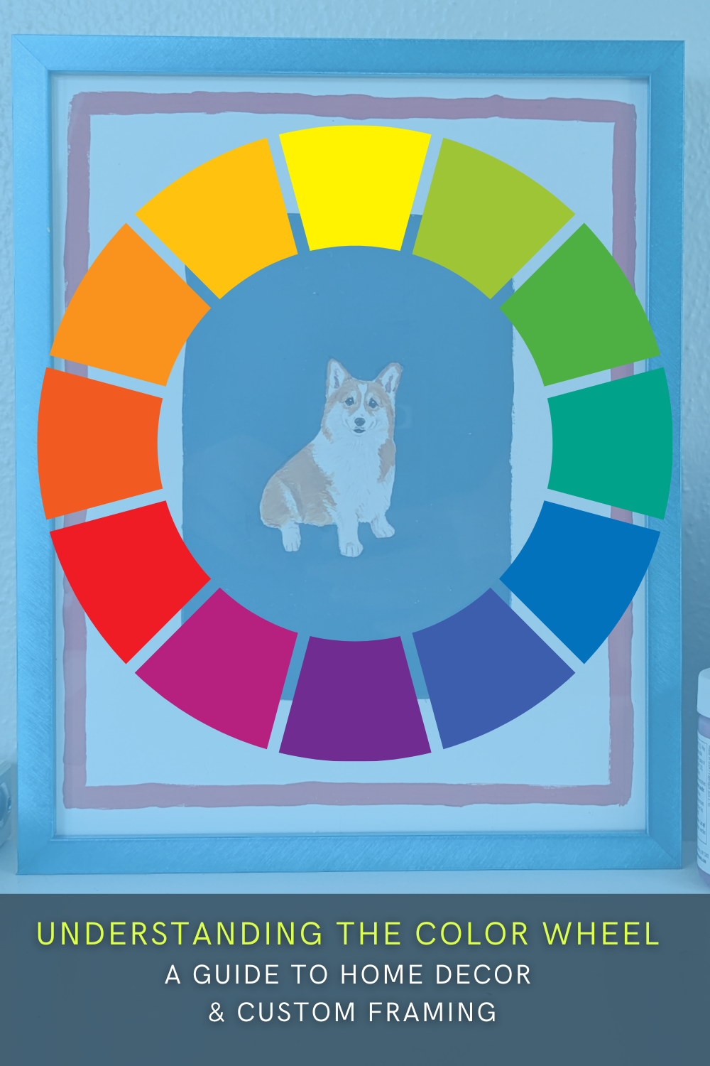
The color wheel is a circular chart that organizes colors based on their relationships to one another. It consists of:
- Primary Colors: Red, blue, and yellow—these cannot be created by mixing other colors.
- Secondary Colors: Green, orange, and purple—formed by mixing two primary colors.
- Tertiary Colors: Created by combining a primary and a secondary color (e.g., blue-green, red-orange).


How the Color Wheel Enhances Home Decor
By using the color wheel, you can create visual harmony in your home decor. Here are a few simple beginner techniques to guide your design choices:
1. Complementary Colors for Bold Contrast
Complementary colors sit opposite each other on the color wheel (for example, blue and orange, red and green). Using these combos can make a bold statement, adding vibrancy to a room. When framing artwork, a complementary frame color can enhance the contrast and make the piece stand out.


2. Analogous Colors for a Cohesive Look
Analogous colors are next to each other on the color wheel (e.g., blue, blue-green, and green). These color schemes create a harmonious and sophisticated look, perfect for a serene and elegant home aesthetic. Custom framing with analogous tones helps unify the artwork with the surrounding decor.


3. Monochromatic Schemes for a Sleek, Modern Feel
A monochromatic color palette consists of different shades, tints, and tones of a single color. This technique creates a polished and cohesive space, allowing textures and details to shine. A black-and-white photograph in a sleek black frame is a perfect example of monochromatic framing done right.
4. Warm vs. Cool Colors for Mood Setting
- Warm colors (reds, oranges, yellows) create a cozy, inviting atmosphere, making them great for living rooms and dining areas.
- Cool colors (blues, greens, purples) evoke calmness and relaxation, ideal for bedrooms and office spaces.


Choosing a frame color based on warm or cool tones can influence the room’s overall mood. This is also referred to as color psychology. A warm-toned frame can add richness, while a cool-toned frame keeps the space feeling light and airy.
Custom Framing & the Color Wheel
When selecting a custom frame, consider how the color interacts with the artwork and the room. Here’s how to apply color theory to framing:
- Match the Frame to an Accent Color: Pull a secondary or accent color from the artwork for the frame to enhance cohesion.
- Use Contrasting Frames for Impact: A dark frame on a light-toned piece or a bold frame on neutral art creates visual interest.
- Neutral Frames for Versatility: Black, white, or natural wood tones work with almost any color scheme, offering flexibility in decor changes.


Final Thoughts
The color wheel is more than just a tool for artists—it’s a guide to creating a balanced and aesthetically pleasing home. When considering paint colors, furniture, or custom frames, using color theory ensures your decor feels intentional and harmonious. By applying these principles, you can confidently decorate your home and make your pictures look and feel professionally curated.
Shop Our Ornate Frames Collection