If you have a poster from your favorite movie, concert, show, or artist, chances are you’ll need a poster frame to display it in your home or office. We’re here to help you choose the best poster frame for your style. There are so many styles and colors of frames, though, so what should you choose?
Posters tend to be bigger than your average print, and you’d obviously want a frame with the correct “Art Size.” Beyond the technical size, though, the frame should complement your poster, both in color and shape.
A few questions to ask yourself:
- What are the measurements of my poster?
- Do I want my poster frame to accent or contrast with the poster’s art?
- Do I want the frame to stand out or “blend in”?
- Can/should I add matting?
Here we’ll take you through some ideas to consider when trying to find that perfect poster frame.
(P.S. If you don’t have a poster yet, you can always look at a few of our recommended places to buy art online, and it might lead you to the start of a great custom framing project!)
A Few Words About Sizing
Typically posters come in a standard size, though there is no set rule as to what constitutes a poster vs. another piece of art.
As a general frame of reference, 24″ X 36″ is usually a larger movie size poster, 18″ X 24″ is often associated with medium-sized posters, and smaller sizes tend to run around the 11″ X 17″ range.
Always remember to measure your art yourself, though; the slightest disparity between the listed measurements and the actual ones can make a significant difference when it comes time to frame!
Should You Use a Wood or Metal Frame?
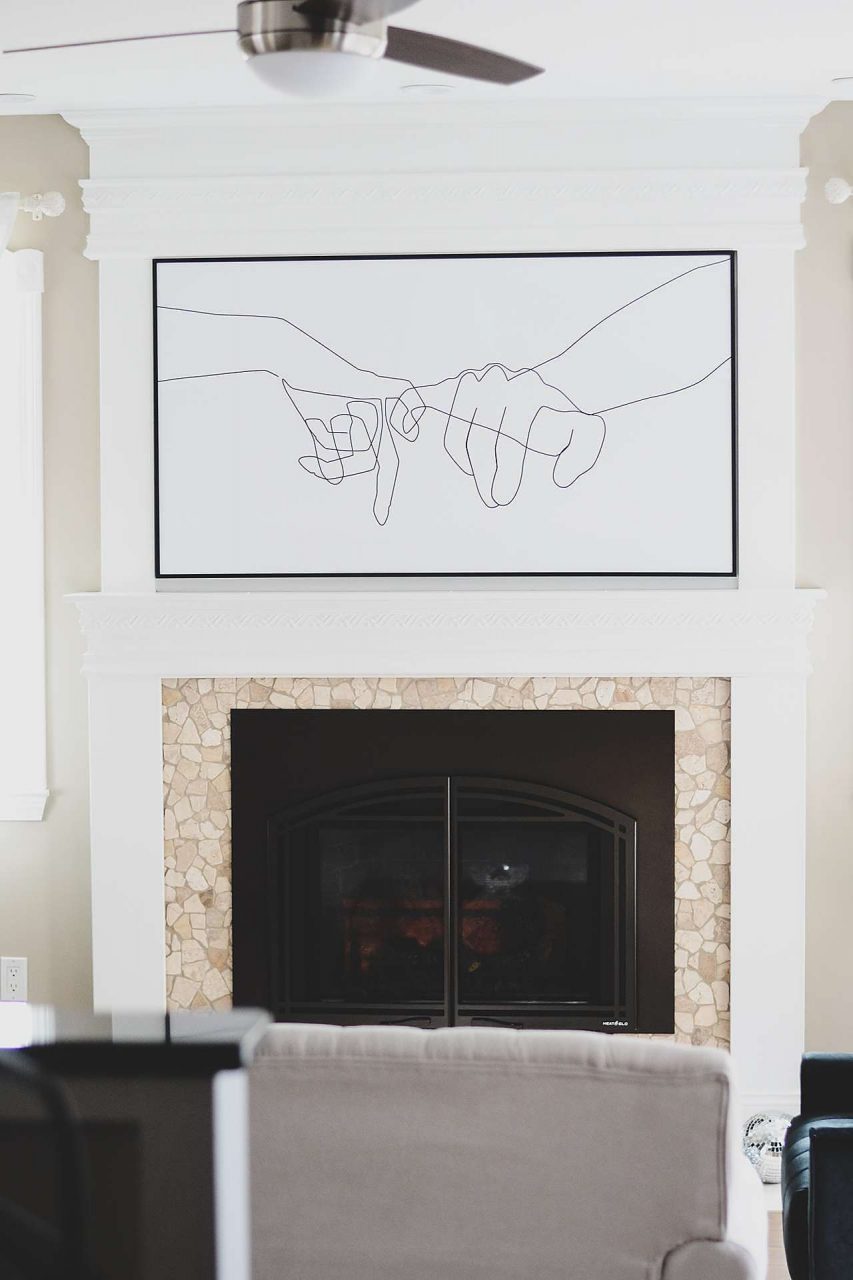
There are multiple layers to the ongoing wood vs. metal frame question. First, let’s talk about the basics: here at Frame It Easy, we can cut metal frames to accommodate a larger size.
The biggest measurement our wood frames can be is 32″ X 42″. So if your poster exceeds that, you might want to go with a metal frame, which can go up to 42″ X 62″.
Beyond physical requirements, there are also stylistic things to take into consideration. Metal is better if you want a more vibrant or neon color. If, however, you want natural or earthy-looking hues, wood would be best.
Maybe, though, it’s not the material of the frame that matters as much as the shape and color of it. In which case, we got you covered, too.
What’s the General Shape And Design of the Art in Your Poster?
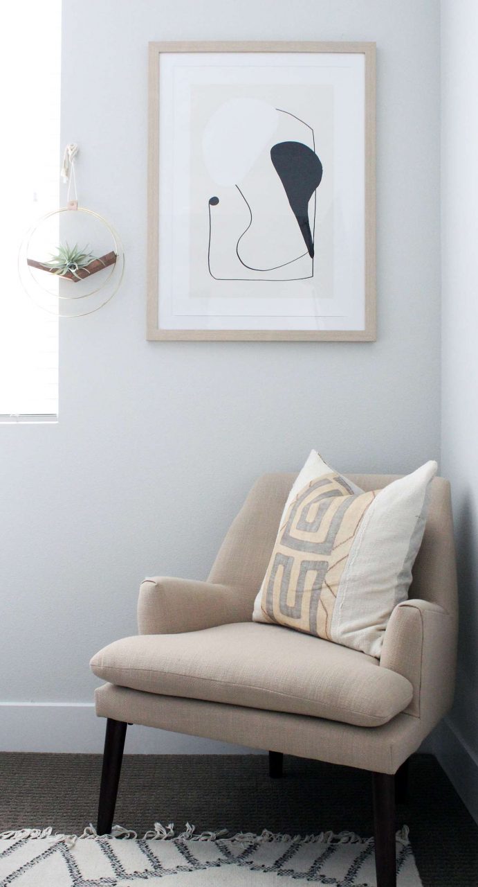
Of course, posters themselves are often rectangular, but the art printed on them can be many different shapes.
Maybe the art on the poster has a lot of circles. Maybe it’s blocky. Either way, try to find something to complement it.
For instance, our Hanover frame has a rounded-off edge. Let’s say you’re framing the Shrek movie poster; it has a lot of bubble-looking letters, as well as the circular-looking antennae at the beginning of the logo. A Hanover style would look great with that to accent the rounded designs.
The opposite is true for posters with blocky shapes and designs. The Bradford, Stafford, and Ashford would all be great, as they would mimic the straighter lines.
Of course, if you’re going for a contrasting effect, mix and match! It’s your frame, so have fun.
If you want something that will really stand out, the Granby would be a great ornate choice.
FREE DOWNLOAD – Poster Size Guide Printable
Consider The Thickness Of the Frame In Relation To The Poster
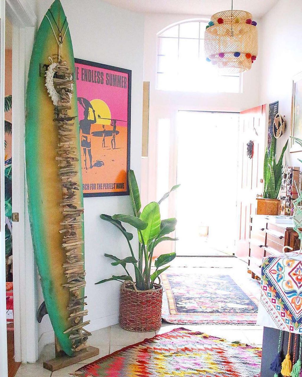
Most posters are big, so you might want to have a thinner frame style displaying them. Let’s say you have a giant poster from one of the many Marvel movies, and you want it to be on full display, with as little frame as possible to potentially overpower it.
If this is the case, we would recommend using either the Ashford or the Hanover frame; both are about 3/8″ in thickness when looking at them straight on. Neither should be too noticeable, especially if you choose a corresponding color (more on that in a bit, though).
This is also something to keep in mind if you have limited display space, but still want to squeeze in one last poster before the blank area on your wall gets covered. If space conservation is on your mind, the narrower designs (Ashford and Hanover) would be best.
Naturally, as with most design choices, the opposite could be true. Let’s say you have a poster that’s minimalistic — maybe a giant one that’s mostly black, with only the film’s logo in the middle, for instance.
In this case, you might want a thicker frame to add to the display and provide a solid barrier for the blank space surrounding the logo. For this, we would recommend Bradford or Stafford. They are thicker — 7/8″, 1″, and 1 1/2″ respectively — and would provide a solid borderline for any poster with sparse details.
Should You Use Gloss or Satin Metal Frames?
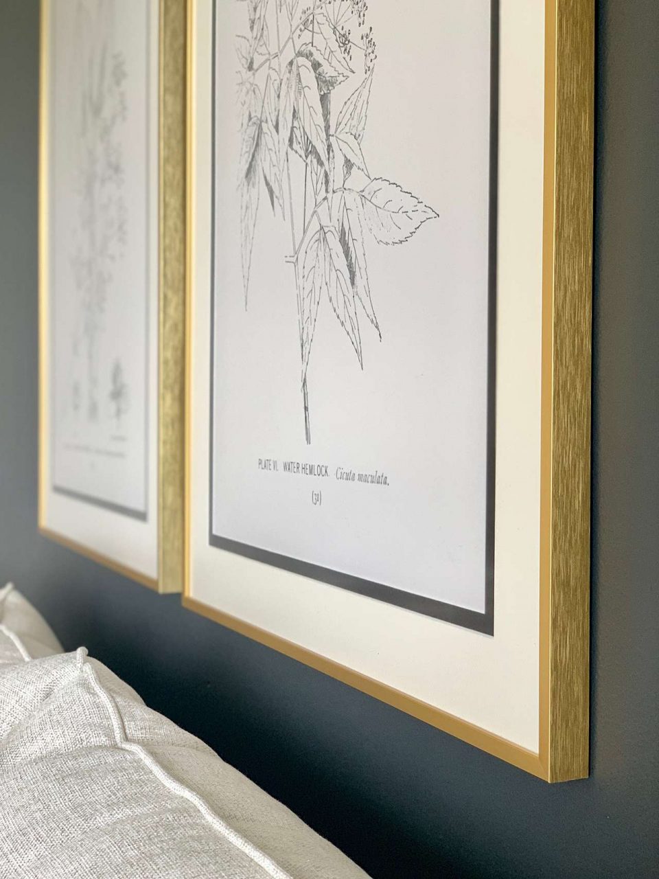
After browsing our site, you might notice that we have three colors — gold, silver, and black — that come in both satin and gloss finishes. The difference is self-explanatory; satin is more matte and gloss is more reflective/shiny.
What could be tough, however, is deciding which one to choose. In terms of popularity, satin is typically purchased more often.
Maybe you have a poster with really bright colors, and shiny silver would make it an even brighter spot on your wall. Maybe it’s the opposite, though, and you have a more matte poster, and it merits a flatter display. In this case, a satin black could really accentuate the flat hues and make everything come together.
Tip: Check out our Instagram Story Highlights for short video clips of our frame styles!
What of the Colorful Frames, Though?!
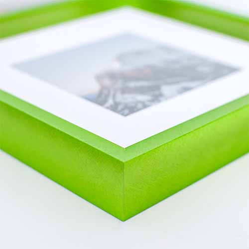
If you’ve skimmed our site, you might have noticed our frame colors go beyond simply the dark and the metallic, though.
There could be a few ways to go about using the more colorful choices. If you don’t have a matboard with your frame, and you want to accent a poster that’s mostly white with a frame of the same color, that could work!
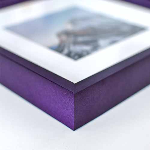
Check Out Our Mystic Metal Picture Frames
But, for those who want to get maybe just a little more in-depth, we figure we’d talk about how to compliment colors — especially if you have a matboard. You can always consult a basic color wheel if you’re ever confused about this, too.
Without getting too technical, colors on opposite sides of the wheel are considered complimenting colors, so they could accent each other nicely with art.
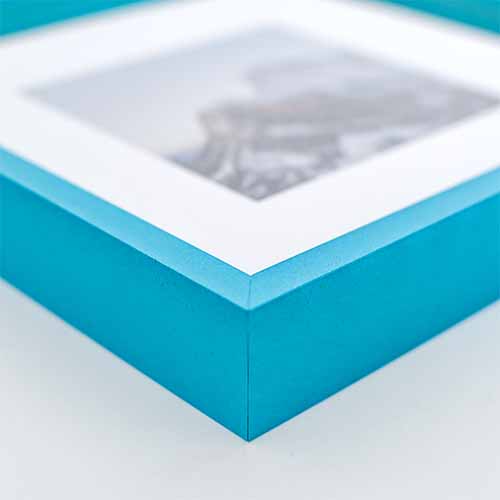
Let’s use the blue frame as an example. You could have a poster with a lot of that color, and you want to use the Hanover blue frame to accent it. How do you make it all pop, though?
If you look at the color wheel, orange sits as blue’s direct opposite. So an orange-colored matboard would be really complimentary. Just something to consider when creating the best poster frame for your style!
If You Decide To Add a Matboard, Be Aware of Size Limitations
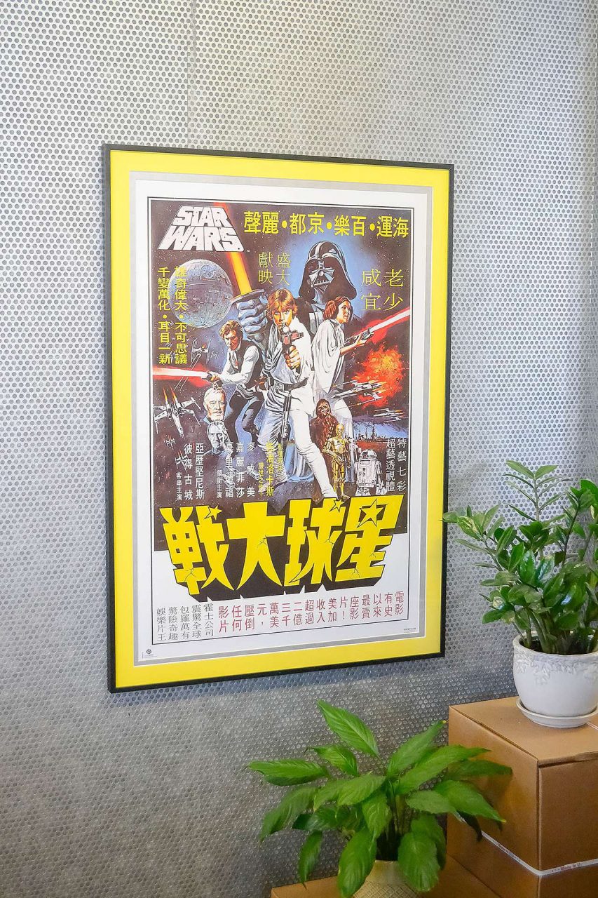
Posters are often larger, measuring around 24″ X 36″ and up. Our matboards are ordered in 32″ X 42″ sheets, so that’s something to keep in mind, too. To mat your art, the size plus matting must be 32″ x 40″ or smaller. Still, if your poster is a smaller or medium size, it could be something great to make the whole thing really come to life.
So What Does This All Mean?
Everything is situational, and if you’ve been reading our blog long enough, you probably know that these are all recommendations — and that your own personal taste trumps any kind of “rule.” Still, you could try to use what we suggest as basic guidelines if you’re ever unsure.
As always, if you have any questions, you can feel free to reach out and we’d be happy to do our best and assist.
