If you’re thinking about custom framing, understanding color theory can help you choose the perfect frame and matboard pairings to complement your prints, photographs, and artwork. Color plays a crucial role in how we experience a space. Maybe you want to create a sense of warmth, energy, or tranquility, and color theory helps us make intentional design choices that bring balance and harmony to our homes. Let’s do a little color lesson, shall we?


Free Downloads – Vintage Color Theory Prints
The Basics of Color Theory
Color theory is based on the color wheel, which consists of primary, secondary, and tertiary colors.
Primary colors are the three base colors that cannot be created by mixing other colors. They form the foundation of all other colors.
- Red
- Blue
- Yellow
Secondary Colors are created by mixing two primary colors in equal amounts.
- Red + Yellow = Orange
- Blue + Yellow = Green
- Red + Blue = Purple
Tertiary colors are made by mixing a primary color with a neighboring secondary color, creating more nuanced shades.
- Red + Orange = Red-Orange
- Yellow + Orange = Yellow-Orange
- Yellow + Green = Yellow-Green
- Blue + Green = Blue-Green
- Blue + Purple = Blue-Purple
- Red + Purple = Red-Purple


It helps us understand how colors interact and influence each other. Here are some key color schemes to consider when decorating your home:
- Complementary Colors are opposites on the color wheel, like blue & orange, and create a bold contrast.
- Analogous Colors, such as green, blue, and teal, are next to each other and offer a harmonious look.
- Monochromatic Colors are different shades of one color and create a sleek, modern feel.
These principles don’t just apply to wall colors—they also influence your home interior and decorative accents, like how you frame your artwork and photography, obviously!
Our Mystic Colorful Picture Frames


Choosing the Right Frame & Matboard Based on Color Theory
1. Bold & High-Contrast Looks with Complementary Colors
If you want a statement piece, pair complementary colors. For example:
🎨 Bright artwork with warm tones (reds, oranges, yellows) pairs well with cool-toned frames (blacks, blues, or greys).
🖼 A warm-toned matboard (cream or beige) can soften a high-contrast color combo, making it feel cohesive.
Best for: Modern spaces, eclectic decor, or rooms that need a pop of energy.
🚨 REMEMBER: A complementary color is a color that sits directly opposite another color on the color wheel. When paired together, complementary colors create high contrast and visual impact.
2. Soft & Serene Aesthetics with Analogous Colors
For a calm, cohesive space, use analogous color pairings.
🌿 Nature-inspired prints with greens and blues look stunning in earthy wood frames.
✨ Matboards in a slightly lighter or darker shade than the artwork create depth without overwhelming the piece.
Best for: Minimalist or boho-inspired interiors.

Color drenching is a bold and stylish way to bring more color into your home by saturating walls, trim, and even ceilings in a single rich hue. This technique creates a cohesive, immersive look that enhances depth and mood, making your space feel more curated and expressive.
An analogous color is a color that sits next to another color on the color wheel. These colors share a common hue, creating a harmonious and cohesive look.
Examples of Analogous Colors: Blue, teal, and green | Red, orange, and yellow | Purple, magenta, and red
Analogous colors are often found in nature (like a sunset or ocean scene) and are great for creating a balanced, visually pleasing design—whether in home décor, artwork, or custom framing.

Outer Mat: 2 1/2″ Deep Red
Inner Mat: 4 1/4″ Deep Red

Matting: 2 1/2″ Deep Red

Matting: 2″ Terra-cotta
3. Elegant & Timeless with Monochromatic Color
A monochromatic frame and matboard pairing create a sophisticated, gallery-style look.
🖤 Black & white photography framed in black with a white or gray matboard keeps things classic.
🤍 Soft, neutral frames like white, cream, or silver work well with pastel artwork for a dreamy aesthetic.
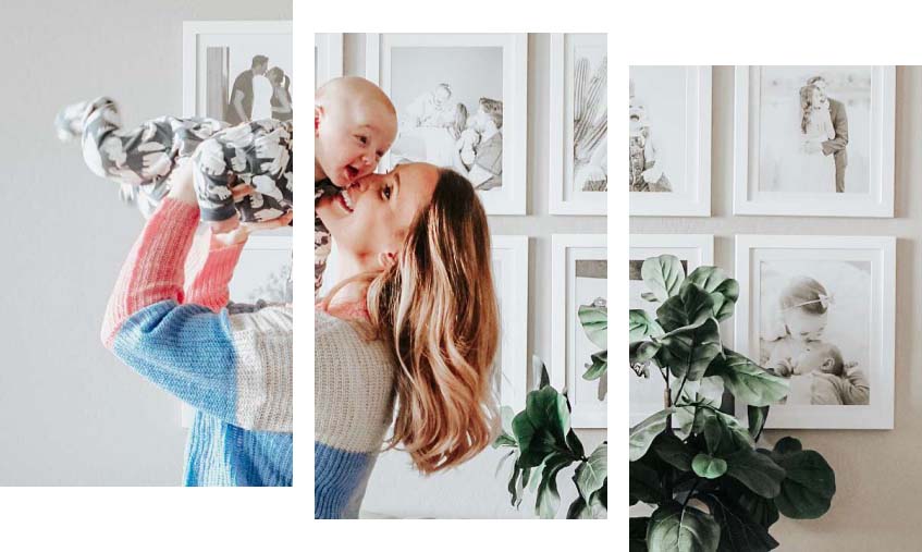
Best for: Contemporary spaces, home offices, and black-and-white photography.

Using Color Psychology in Framing
Beyond just aesthetics, colors evoke emotions. Keep this in mind when choosing a frame color for different rooms:
- Warm Colors (reds, oranges, yellows): Energizing & inviting—great for living rooms or kitchens.
- Cool Colors (blues, greens, purples): Calming & sophisticated—ideal for bedrooms and offices.
- Neutrals (whites, greys, blacks, browns): Versatile & timeless—perfect for nearly any space.

Bringing It All Together:
Choosing the right frame and matboard combination enhances the way a piece looks within your space. Whether you’re framing a vibrant art print, a sentimental photograph, or a delicate watercolor painting, considering color relationships will help you achieve a polished, cohesive look.
Not sure where to start? Have some fun playing with different combinations with our easy online frame designer!