Color psychology is not as “heady” as it sounds. It is actually quite a simple concept. It’s happening every day to everyone, whether they realize it or not. Let us explain. Have you ever walked into a room and immediately felt some type of way? Think of how walking into a bright and colorful grocery store makes you feel energized and maybe even a little hungry! That all has to do with color, and how color choices can impact how you feel. Let’s dive into the basics of color psychology and explore how you can harness these techniques to enhance your art and interior spaces.

What is Color Psychology?
Color psychology is the study of how colors can affect your emotions, behaviors, and perceptions. It looks at how different color hues and shades can influence mood, both on a conscious and subconscious level. This concept, along with the principles of color theory, is extremely relevant in marketing, design, art, and interior decorating, where color choices can significantly impact someone’s experience and consumer behavior. And believe us, it works!
The Emotional Impact of Colors
Understanding how colors affect mood is the first step to wrapping our heads around this. For starters, each color has its own psychological impact, subtly influencing our feelings and behaviors. Let’s break down some colors and their associated emotions:
- Red: energy, passion, and excitement. Red can stimulate the senses and increase heart rate. It’s a great choice for restaurants, grocery stores, living rooms, and other social spaces.
- Blue: calming and serene. Blue helps reduce stress and creates an atmosphere of tranquility. It’s perfect for bedrooms and bathrooms where relaxation is key, but can also be used in offices to enhance focus and productivity.
- Yellow: cheerful, uplifting, happy, and warm. Yellow is great for kitchens and dining areas where you want to encourage social interaction and positivity. This color makes people feel comfortable.
- Green: nature, growth, and renewal. Green is soothing and refreshing, just think nature! It’s so versatile and works well in any room to promote balance and harmony.
- Purple: luxury, creativity, elegance. Purple can add an element of sophistication and luxury to any space. Lighter shades of lavender are calming, while deeper shades like plum can add some drama and moodiness to a room.
- Orange: vibrant and energetic. Orange stimulates enthusiasm and creativity. It’s a good choice for children’s playrooms or workout areas but can be overwhelming in large doses, so keep it subtle!
- Black: power, sophistication, and mystery. Black is commonly used by luxury brands to convey a sense of exclusivity. Think of examples like the brands Chanel or Nike.
- Neutral Colors: Colors like white, gray, and beige are versatile and can exude cleanliness and simplicity. They are excellent backdrops, a blank canvas for your “color psychology”, allowing other colors and decor elements to pop.

Color Psychology for Different Rooms
Now that we have colors and their psychological impact all laid out, let’s apply this to different rooms in the home. Here are some tips for selecting color schemes that align with the purpose and “vibe” of each space:
Living Room: The living room is a space to unwind or entertain guests. Warm colors like burgundy or yellow can create a welcoming and social atmosphere, while cooler tones like blue and green can make the space feel calm and serene. If you prefer a neutral palette, consider keeping it simple, but adding pops of color through accessories like cushions, rugs, or artwork.
Bedroom: The goal here is to create a restful and peaceful environment. Soft, cool colors like blue, green, and lavender would promote relaxation and sleep. We recommend avoiding overly stimulating bright colors like reds or oranges. Instead, opt for more muted shades like dusty pink!
Kitchen: We all know the kitchen is the heart of the home! It’s where families gather and connect. Bright, cheerful colors like yellow or orange can stimulate appetite and conversation. Cooler colors like green or blue tones create a clean, fresh feel. White is a very popular choice for kitchens, giving a modern feel that you can pair with any accent color.


Bathroom: Bathrooms can go one of two ways. You can choose colors that promote a sense of cleanliness and tranquility. Light blues, greens, and neutral tones help you to relax and unwind. Alternatively, add a touch of drama or moodiness to your bathroom by incorporating rich colors like deep purple or charcoal gray. Small rooms allow for more experimentation! Less pressure, more creativity!
Home Office: Productivity and focus are the priority of a home office. Blue is an excellent choice as it can enhance concentration and efficiency. Green is another option, providing a refreshing and balanced environment. If you prefer warmer tones, go for subdued shades like soft yellow, gray, or beige to keep the space inviting. As always, a pop of color goes a long way!
Dining Room: Dining rooms benefit from warm, rich colors that spark conversation. Deep red/maroon is a traditional choice, but you can also use deep shades of green or blue for a more sophisticated look. If your dining area is part of an open floor plan, consider using a color that ties in with nearby areas for some interior design cohesiveness.

What Do Frames Have To Do With Color Psychology?
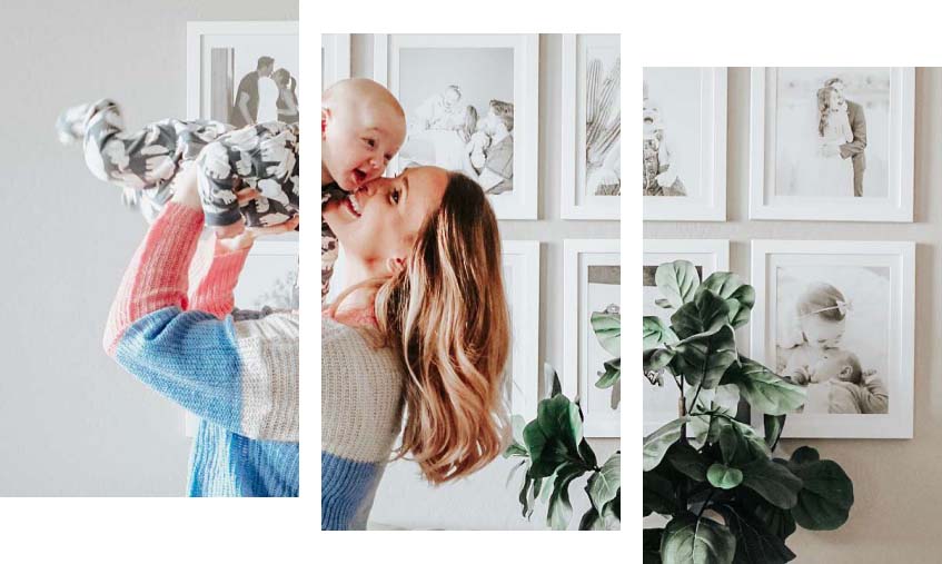
Think of picture frames as the icing on your cake, the sprinkles on your ice cream, the gravy on your mashed potatoes! No space is complete without some art on the walls. From a color psychology standpoint, there are two ways for us to help you.
- Add color with frames: We have kindly and conveniently laid out all of our colorful picture frames for you to peruse. With bright picture frames, you can keep your art simple (think black and white photography) but add that pop of color with our Ashford frame in hot pink.
- Add color with art: If you want to keep your frames simple, then explore bright pieces of artwork. This is what we refer to as “let the art speak for itself.” Our metal picture frames come in a variety of thicknesses. Our latest obsession is our Oxford metal frame, available in three finishes. Your choice of satin black, brushed pewter, or brushed bronze. Why not get one of each for a little metallic-inspired gallery wall?
(Note: We can print your art for you, so your frame comes 100% ready to hang!)
FREE Download – Colorful Art Printables

Final Thoughts
The concept of color psychology is a powerful tool in art and design, allowing creatives to harness the viewer’s subconscious to feel the right feels. Walking into a room with neon green walls is going to hit differently than a room with soothing pale yellow walls. Similarly, a painting of a light blue sky will evoke different emotions than a dark and stormy scene.
By understanding how different colors affect mood and behavior, you can make informed artistic choices that trigger a certain emotion. Whether you’re aiming for a calm and serene bedroom or a vibrant and energetic kitchen, the right color choices can make all the difference. So go ahead, embrace the power of color, and transform your home into a place that truly reflects your personality and style.